
SAP Fiori Elements — How to Build Enterprise Apps in Half the Time Without Writing Hundreds of Lines of Code
Table of Contents
- • What Is SAP Fiori Elements — The Honest Explanation
- • Fiori Elements vs Custom SAPUI5 — When to Use Which
- ↳ Use Fiori Elements when:
- ↳ Use Custom SAPUI5 when:
- • The Four Fiori Elements Floorplans — close look
- ↳ Floorplan 1 — List Report + Object Page
- ↳ Floorplan 2 — Worklist
- ↳ Floorplan 3 — Overview Page
- ↳ Floorplan 4 — Analytical List Page
- • How Annotations Actually Work — The Engine Behind Fiori Elements
- ↳ @UI Annotations — Control UI Appearance
- ↳ @UI.fieldGroup — Object Page Sections
- ↳ @UI.headerInfo — Page Titles
- • Custom Actions in Fiori Elements — Adding Business Logic
- • Fiori Tools — Accelerating Fiori Elements Development
- • Real Project Example — Building a Complete Fiori Elements App
- • Common Annotation Mistakes That Break Fiori Elements Apps
- • Fiori Elements Career Value — Why This Skill Matters
- • What This Means for Your Work
- • Self-Assessment Checkpoint
 Figure 1: SAP Fiori Elements versus custom code development timelines.
Okay so let me tell you something that genuinely blew my mind when I first saw it.
A senior Fiori developer on a project sat down, spent about 45 minutes writing some annotations in a CDS view, ran a few Fiori tools commands in Business Application Studio — and had a fully working, production-quality List Report application running in the browser.
Searchable table. Filter bar with smart dropdowns. Sort and group functionality. Navigation to detail page. Edit mode with field validations. Save and cancel flows. All of it.
45 minutes.
I had spent two weeks trying to build something similar from scratch in custom SAPUI5.
That was my proper introduction to SAP Fiori Elements — and it at its core changed how I think about Fiori development.
This post is everything I’ve learned about Fiori Elements since that moment. What it is, how it works, which floorplan to use when, how annotations drive the entire thing, and how to actually build something real with it.
If you’ve been building everything from scratch in SAPUI5 — this post is going to save you an enormous amount of time on every project going forward.
Let’s get into it.
What Is SAP Fiori Elements — The Honest Explanation
SAP Fiori Elements is a framework within SAPUI5 that generates Fiori application UI automatically from backend metadata and annotations.
Let me break that sentence down because every word matters.
Framework within SAPUI5 — Fiori Elements isn’t a separate technology. It’s built on top of SAPUI5. Everything SAPUI5 does, Fiori Elements inherits. You’re not abandoning SAPUI5 knowledge — you’re building on top of it.
Generates UI automatically — instead of writing views, controllers, data binding code, navigation logic — Fiori Elements generates all of that at runtime based on instructions you provide.
From backend metadata and annotations — those instructions come from your OData service metadata and CDS annotations in your ABAP backend. You describe what the UI should contain and how it should behave — from ABAP — and Fiori Elements builds the actual screens.
The result: you write dramatically less frontend code while getting a Fiori app that looks and behaves exactly like SAP’s own standard apps — because it literally uses the same framework SAP uses to build standard Fiori apps.
Fiori Elements vs Custom SAPUI5 — When to Use Which
This is the question every project team debates and it deserves a straight answer.
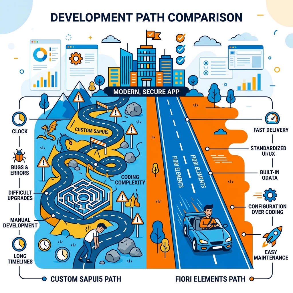 Figure 2: Comparing custom coding obstacles with standard metadata execution roads.
Use Fiori Elements when:
- Requirement fits standard CRUD patterns — list, detail, create, edit, delete.
- Standard floorplans cover the use case — list report, object page, worklist, overview page.
- Consistent SAP-standard look and feel is important.
- Timeline is tight — Fiori Elements delivers 3x to 5x faster than custom SAPUI5.
- Long-term maintainability matters — SAP upgrades Fiori Elements automatically.
Use Custom SAPUI5 when:
- Highly unique UI behavior that no standard floorplan supports.
- Complex custom visualizations — custom charts, unique layouts, gaming-style interfaces.
- Heavily branded consumer-facing apps that need to look nothing like standard SAP.
- Very specific interaction patterns that Fiori Elements simply cannot produce.
Honest reality check — on 80% of real SAP implementation projects, Fiori Elements covers requirements completely. Custom SAPUI5 from scratch is the exception, not the rule. Many freshers learn this backwards — spending months on custom SAPUI5 fundamentals before discovering Fiori Elements does the job faster on actual projects.
Learn custom SAPUI5 to understand how things work underneath. Use Fiori Elements to deliver things efficiently on projects.
The Four Fiori Elements Floorplans — close look
Fiori Elements provides four pre-built application patterns called floorplans. Each is designed for specific use cases. Choosing correctly from the start saves enormous rework.
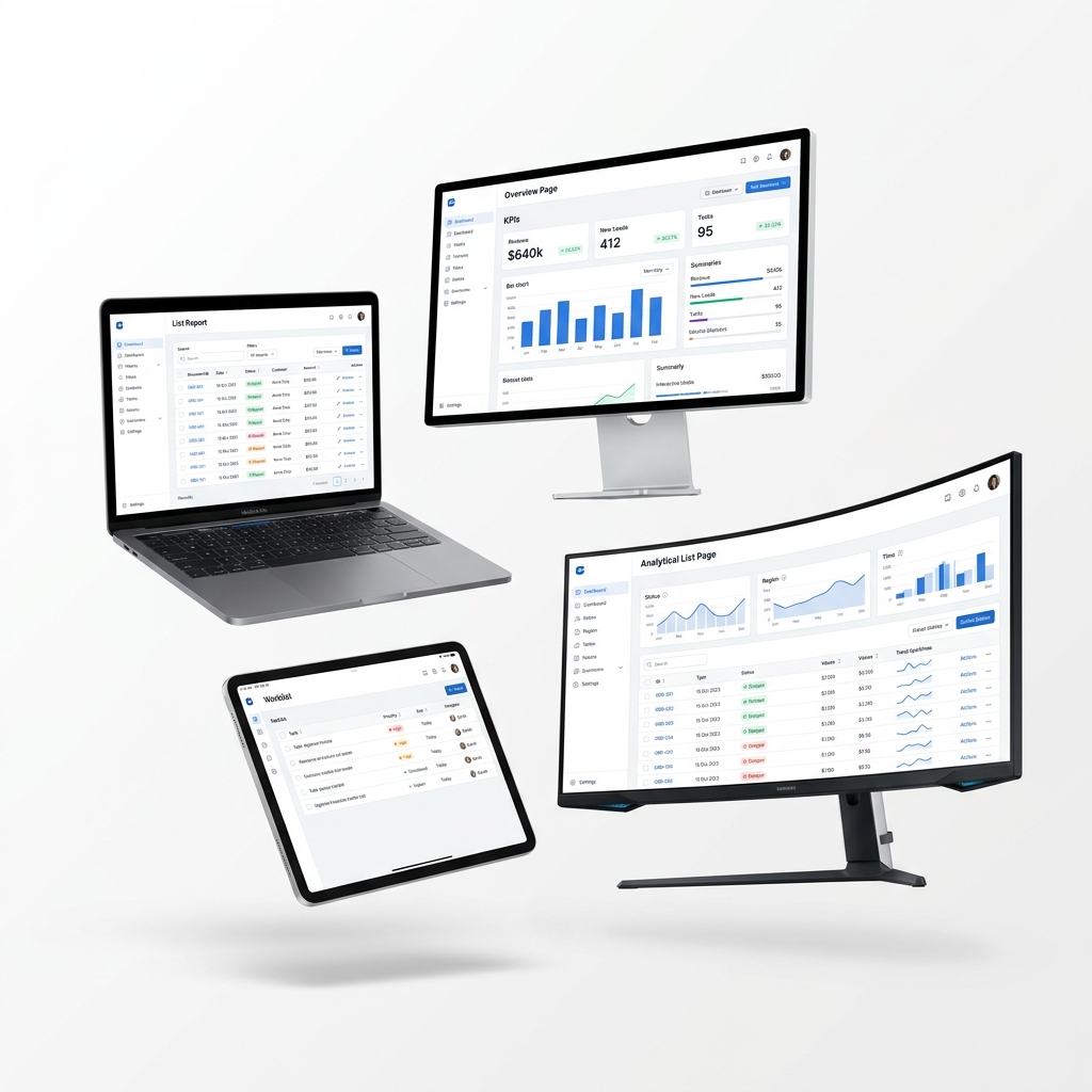 Figure 3: Floating device mockups representing the core Fiori Elements patterns.
Explore the visual layouts and typical scenarios of the four Fiori Elements floorplans interactively in the switcher below:
  <button class="floorplan-btn active-floorplan w-full text-left p-2.5 rounded text-[12px] font-semibold transition-all border outline-none bg-primary/5 text-primary border-primary flex flex-col gap-0.5" data-floorplan="listreport">
    <span>List Report + Object Page</span>
    <span class="text-[9px] font-normal text-ink-muted-80">Master-Detail CRUD app</span>
  </button>

  <button class="floorplan-btn w-full text-left p-2.5 rounded text-[12px] font-semibold transition-all border outline-none bg-transparent border-hairline text-ink hover:bg-canvas-parchment flex flex-col gap-0.5" data-floorplan="worklist">
    <span>Worklist Queue</span>
    <span class="text-[9px] font-normal text-ink-muted-80">Task-based queue table</span>
  </button>

  <button class="floorplan-btn w-full text-left p-2.5 rounded text-[12px] font-semibold transition-all border outline-none bg-transparent border-hairline text-ink hover:bg-canvas-parchment flex flex-col gap-0.5" data-floorplan="overview">
    <span>Overview Page (OVP)</span>
    <span class="text-[9px] font-normal text-ink-muted-80">Dashboard cockpit cards</span>
  </button>

  <button class="floorplan-btn w-full text-left p-2.5 rounded text-[12px] font-semibold transition-all border outline-none bg-transparent border-hairline text-ink hover:bg-canvas-parchment flex flex-col gap-0.5" data-floorplan="analytical">
    <span>Analytical List Page</span>
    <span class="text-[9px] font-normal text-ink-muted-80">Visual chart drilldown</span>
  </button>
</div>

<div class="flex-1 flex flex-col justify-between overflow-hidden bg-canvas-parchment p-6">
  <div class="flex-1 overflow-y-auto mb-4">

    <!-- List Report -->
    <div id="fp-listreport-panel" class="floorplan-panel flex flex-col gap-3 h-full">
      <div class="border border-hairline rounded bg-canvas p-4 shadow-sm flex flex-col gap-3">
        <div class="flex justify-between items-center border-b border-hairline pb-2">
          <span class="text-[12px] font-bold text-ink">List Report: Manage Sales Orders</span>
          <span class="text-[9px] bg-primary/10 text-primary border border-primary/20 px-2 py-0.5 rounded font-mono">@UI.lineItem</span>
        </div>

        <div class="bg-canvas-parchment border border-hairline rounded p-2.5 grid grid-cols-2 gap-2 text-[10px]">
          <div class="flex flex-col gap-0.5">
            <span class="font-semibold text-ink-muted-80">Sales Order</span>
            <div class="bg-canvas border border-hairline px-2 py-1 text-ink-muted-48 rounded-sm">Filter field</div>
          </div>
          <div class="flex flex-col gap-0.5">
            <span class="font-semibold text-ink-muted-80">Customer ID</span>
            <div class="bg-canvas border border-hairline px-2 py-1 text-ink-muted-48 rounded-sm">Filter field</div>
          </div>
        </div>

        <div class="border border-hairline rounded overflow-hidden text-[10px] text-ink">
          <div class="bg-canvas-parchment p-2 border-b border-hairline grid grid-cols-3 font-bold text-ink-muted-80">
            <span>Order No</span>
            <span>Customer</span>
            <span class="text-right">Net Value</span>
          </div>
          <div class="p-2 border-b border-hairline grid grid-cols-3">
            <span class="text-blue-600 font-mono font-semibold">10002931</span>
            <span>Hindustan Ltd</span>
            <span class="text-right">INR 4,50,000</span>
          </div>
        </div>
      </div>
      <p class="text-[12px] text-ink-muted-80 leading-relaxed mt-2">
        **Use Case:** Full transactional processing. Clicking any order row navigates to the detailed **Object Page** via `manifest.json` routes, displaying related tables and triggering editing workflows.
      </p>
    </div>

    <!-- Worklist -->
    <div id="fp-worklist-panel" class="floorplan-panel flex flex-col gap-3 h-full hidden">
      <div class="border border-hairline rounded bg-canvas p-4 shadow-sm flex flex-col gap-3">
        <div class="flex justify-between items-center border-b border-hairline pb-2">
          <span class="text-[12px] font-bold text-ink">Worklist: Invoice Approval Queue</span>
          <span class="text-[9px] bg-emerald-500/10 text-emerald-600 border border-emerald-500/20 px-2 py-0.5 rounded font-mono">To-Do Queue</span>
        </div>

        <div class="border border-hairline rounded overflow-hidden text-[10px] text-ink">
          <div class="bg-canvas-parchment p-2 border-b border-hairline grid grid-cols-3 font-bold text-ink-muted-80">
            <span>Invoice No</span>
            <span>Amount</span>
            <span class="text-right">Action</span>
          </div>
          <div class="p-2 border-b border-hairline grid grid-cols-3 items-center">
            <span class="font-mono font-semibold">INV-98001</span>
            <span class="font-mono">INR 1,20,000</span>
            <span class="text-right"><button class="bg-primary text-white text-[9px] px-2 py-0.5 rounded-sm">Approve</button></span>
          </div>
        </div>
      </div>
      <p class="text-[12px] text-ink-muted-80 leading-relaxed mt-2">
        **Use Case:** Simplified task worklists. Omits the smart filter bar so users focus linearly on working down a queue of pending tasks assigned to their role.
      </p>
    </div>

    <!-- Overview Page -->
    <div id="fp-overview-panel" class="floorplan-panel flex flex-col gap-3 h-full hidden">
      <div class="border border-hairline rounded bg-canvas p-4 shadow-sm flex flex-col gap-2">
        <div class="flex justify-between items-center border-b border-hairline pb-2 mb-2">
          <span class="text-[12px] font-bold text-ink">Overview Page: Procurement Cockpit</span>
          <span class="text-[9px] bg-amber-500/10 text-amber-600 border border-amber-500/20 px-2 py-0.5 rounded font-mono">Card Deck</span>
        </div>

        <div class="grid grid-cols-2 gap-2 text-[10px]">
          <div class="border border-hairline rounded p-2 bg-canvas-parchment flex flex-col gap-1">
            <span class="text-[8px] font-bold text-ink-muted-80 uppercase">Total Spend</span>
            <span class="text-[14px] font-bold text-ink">₹12.4 Cr</span>
            <span class="text-[8px] text-emerald-600 font-semibold">▲ 4.2% MoM</span>
          </div>
          <div class="border border-hairline rounded p-2 bg-canvas-parchment flex flex-col gap-1">
            <span class="text-[8px] font-bold text-ink-muted-80 uppercase">Overdue POs</span>
            <div class="flex justify-between font-mono text-[8px] border-b border-hairline pb-0.5">
              <span>PO-2831</span>
              <span class="text-red-500 font-bold">5 Days</span>
            </div>
            <div class="flex justify-between font-mono text-[8px]">
              <span>PO-2890</span>
              <span class="text-orange-500 font-bold">2 Days</span>
            </div>
          </div>
        </div>
      </div>
      <p class="text-[12px] text-ink-muted-80 leading-relaxed mt-2">
        **Use Case:** Executive role dashboards. Displays real-time KPIs, lists, and summary charts. Cards can be configured independently to query distinct backend entities.
      </p>
    </div>

    <!-- Analytical List Page -->
    <div id="fp-analytical-panel" class="floorplan-panel flex flex-col gap-3 h-full hidden">
      <div class="border border-hairline rounded bg-canvas p-4 shadow-sm flex flex-col gap-3">
        <div class="flex justify-between items-center border-b border-hairline pb-2">
          <span class="text-[12px] font-bold text-ink">Analytical List Page: Stock Level Monitor</span>
          <span class="text-[9px] bg-purple-500/10 text-purple-600 border border-purple-500/20 px-2 py-0.5 rounded font-mono">Chart + Table</span>
        </div>

        <div class="bg-canvas-parchment border border-hairline rounded p-2.5 flex flex-col gap-1 text-[10px]">
          <span class="font-semibold text-ink-muted-80 text-[8px] uppercase">Stock Quantity by Category</span>
          <div class="flex items-end gap-1.5 h-[60px] pt-2 pb-1 border-b border-hairline">
            <div class="bg-primary hover:bg-primary-focus cursor-pointer w-1/4 h-[30px] rounded-t-sm" title="Equipment: 300"></div>
            <div class="bg-primary hover:bg-primary-focus cursor-pointer w-1/4 h-[50px] rounded-t-sm" title="Spare Parts: 500"></div>
            <div class="bg-red-500 hover:bg-red-600 cursor-pointer w-1/4 h-[12px] rounded-t-sm" title="Chemicals: 120 (Alert)"></div>
            <div class="bg-primary hover:bg-primary-focus cursor-pointer w-1/4 h-[42px] rounded-t-sm" title="Office: 420"></div>
          </div>
        </div>
      </div>
      <p class="text-[12px] text-ink-muted-80 leading-relaxed mt-2">
        **Use Case:** Exception-driven analysis. Clicking on any colored bar in the top chart instantly filters the details in the table list below to evaluate outlier items immediately.
      </p>
    </div>

  </div>

  <div class="border-t border-hairline pt-3 flex items-center justify-between text-[11px] text-ink-muted-48">
    <span>*Select floorplans in the sidebar to review floorplan details.</span>
    <span class="text-primary font-semibold">SAP Fiori Floorplan Matrix</span>
  </div>
</div>
Floorplan 1 — List Report + Object Page
This is the most commonly used Fiori Elements combination — probably 60% of all Fiori Elements apps on real projects use this pattern.
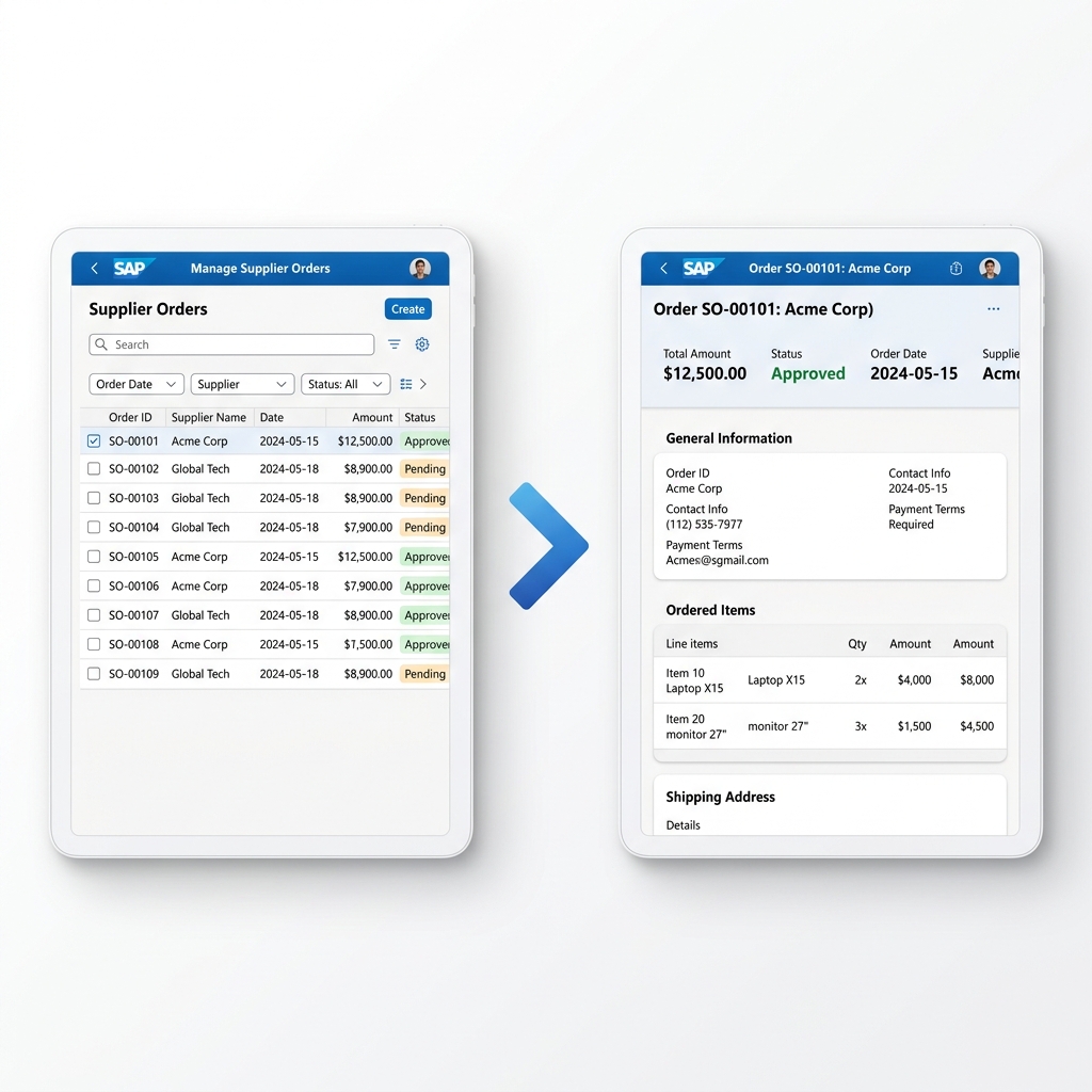 Figure 4: List Report table screen mapping details onto the Object Page.
List Report is a full-screen table with:
- Smart filter bar at top — collapsible, remembers user’s last filters.
- Responsive table below — sortable, groupable, exportable to Excel.
- Toolbar with standard actions — Create, Delete, custom buttons.
- Variant management — users save their filter and column configurations.
Object Page is the detail screen that opens when user selects a row:
- Header section with key information and KPI tiles.
- Multiple sections below — each showing related data.
- Multiple tabs for organizing large amounts of information.
- Edit mode — inline editing with field validation.
- Related objects — associated data displayed in separate tables.
Real example of when to use this: Purchase Order management app — List Report shows all purchase orders with filter by vendor, date range, status. User selects one order — Object Page shows full order header, line items table, delivery schedule, invoice status, approval history. Edit button allows modification. All standard behavior, zero custom controller code.
/* manifest.json routing for List Report + Object Page */
"targets": {
    "PurchaseOrderList": {
        "type": "Component",
        "id": "PurchaseOrderList",
        "name": "sap.fe.templates.ListReport",
        "options": {
            "settings": {
                "entitySet": "PurchaseOrder",
                "navigation": {
                    "PurchaseOrder": {
                        "detail": {
                            "route": "PurchaseOrderObjectPage"
                        }
                    }
                }
            }
        }
    },
    "PurchaseOrderObjectPage": {
        "type": "Component",
        "id": "PurchaseOrderObjectPage",
        "name": "sap.fe.templates.ObjectPage",
        "options": {
            "settings": {
                "entitySet": "PurchaseOrder"
            }
        }
    }
}
That routing configuration — combined with properly annotated CDS view — produces a complete two-screen application. No view XML files written manually. No controller JavaScript written manually.
Floorplan 2 — Worklist
Worklist is a simplified version of List Report — without the collapsible smart filter bar. Designed for task-based scenarios where users work through a list of items.
Think of it as a to-do list for business users — approval queues, exception items requiring attention, tasks assigned to current user.
When to choose Worklist over List Report:
- Primary use case is processing items from a queue.
- Filtering is simple — maybe just a search field.
- Users work linearly through items rather than searching for specific ones.
- Simpler, cleaner UI is preferred over full filter capabilities.
Example — Open Invoice Approval Worklist. User sees all invoices pending their approval. Selects one, reviews, approves or rejects. Moves to next. No complex filtering needed — everything here is already relevant to this user.
Floorplan 3 — Overview Page
Overview Page is at its core different from the other floorplans. Instead of a master-detail pattern, it shows multiple data streams simultaneously on one screen using cards.
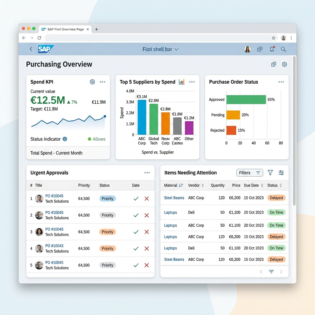 Figure 5: Executive cockpit displaying real-time KPI tiles and list cards.
Each card on an Overview Page has its own independent data source, shows specific subsets of information, and is highly interactive.
Card types available:
- List Card — shows top N items from a list.
- Table Card — compact table view.
- KPI Header Card — large KPI number with trend indicator.
- Bar Chart Card — horizontal bar chart.
- Donut Chart Card — pie/donut visualization.
- Stack Card — grouped items with header.
When to use Overview Page: Role-based cockpit scenarios — Procurement Manager dashboard showing: overdue PO approvals card, spend by category chart card, top vendors by volume card, exceptions requiring attention card, recent GR postings card. All on one screen, all real-time, all interactive.
CDS annotation for Overview Page card:
@UI.chart: [{
    chartType: #BAR,
    dimensions: ['Vendor'],
    measures: ['NetValue'],
    title: 'Top Vendors by Spend'
}]
That annotation — sitting in your CDS view — tells Overview Page to render a bar chart showing vendor spend. SAP Fiori Elements reads it and generates the complete chart card automatically.
Floorplan 4 — Analytical List Page
Analytical List Page (ALP) combines analytical and transactional capabilities on one screen.
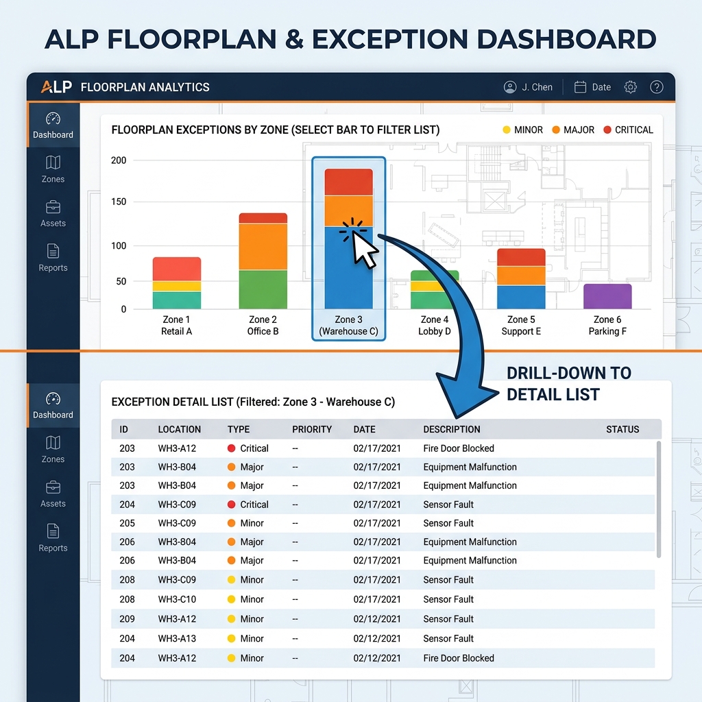 Figure 6: Interactive exception monitor linking visual charts to detailed lists below.
Top section — interactive chart showing aggregated data (Bar chart, line chart, donut).
Bottom section — detailed list filtered by user’s chart selection. Click a bar in the chart — list below filters to show only that segment’s records.
This is powerful for exception management scenarios where users need to:
- See the big picture visually.
- Identify exceptions or outliers in the chart.
- Drill into specific records immediately.
Example — Inventory Management ALP. Top chart shows stock levels by material category — bars turn red for below-minimum stock. User clicks the red Chemicals bar — bottom list immediately shows all chemical materials with low stock. User can then take action on specific items directly from the list.
ALP requires both chart annotations and table annotations on the same CDS view — telling Fiori Elements what to show in analytical view versus list view.
How Annotations Actually Work — The Engine Behind Fiori Elements
This is the concept that makes or breaks your understanding of Fiori Elements. Once you truly get annotations — everything else clicks.
Annotations are metadata attached to CDS view fields that tell Fiori Elements how to render those fields in the UI.
No annotation = field exists in backend but doesn’t appear in Fiori UI unless you explicitly add it. Right annotation = field automatically appears in correct place in correct format.
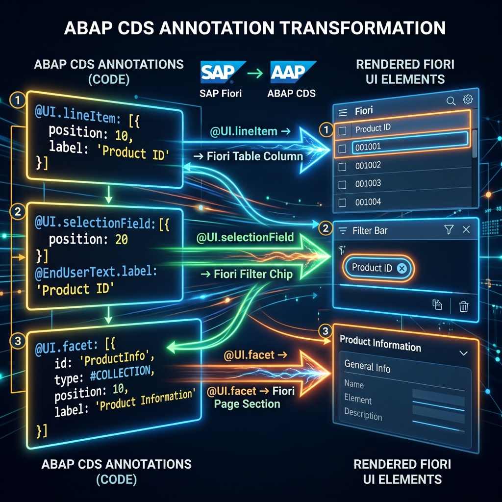 Figure 7: Data annotations converting backend schemas to interactive UI objects.
Let’s walk through the most important annotation vocabularies:
@UI Annotations — Control UI Appearance
define view entity ZC_SalesOrder as select from vbak {

    @UI.lineItem: [{ position: 10, label: 'Order No' }]
    @UI.selectionField: [{ position: 10 }]
    @UI.identification: [{ position: 10 }]
    key vbak.vbeln as SalesOrder,

    @UI.lineItem: [{ position: 20, label: 'Customer' }]
    @UI.selectionField: [{ position: 20 }]
    vbak.kunnr as Customer,

    @UI.lineItem: [{
        position: 30,
        label: 'Net Value',
        criticality: 'Criticality'
    }]
    vbak.netwr as NetValue,

    @UI.lineItem: [{ position: 40, label: 'Status' }]
    @UI.selectionField: [{ position: 40 }]
    vbak.gbstk as OrderStatus,

    " Hidden field used for criticality coloring
    case
        when vbak.netwr > 100000 then 3  " Green
        when vbak.netwr > 50000  then 2  " Orange
        else 1                            " Red
    end as Criticality
}- @UI.lineItem — field appears as column in List Report table. Position controls column order.
- @UI.selectionField — field appears in filter bar. Position controls filter order.
- @UI.identification — field appears in Object Page header section.
- criticality reference — that
Criticalityfield reference makes NetValue column automatically color-coded — green for high values, orange for medium, red for low. No frontend code needed for this visual indicator.
@UI.fieldGroup — Object Page Sections
@UI.facet: [{
    id: 'GeneralInfo',
    type: #COLLECTION,
    label: 'General Information',
    position: 10
}, {
    id: 'OrderDetails',
    type: #FIELDGROUP_REFERENCE,
    targetQualifier: 'OrderDetails',
    label: 'Order Details',
    position: 20,
    parentId: 'GeneralInfo'
}]

@UI.fieldGroup: [{ qualifier: 'OrderDetails', position: 10 }]
Customer,

@UI.fieldGroup: [{ qualifier: 'OrderDetails', position: 20 }]
OrderDate,

@UI.fieldGroup: [{ qualifier: 'OrderDetails', position: 30 }]
NetValue,- @UI.facet — defines sections on Object Page. COLLECTION type creates a tab or section container. FIELDGROUP_REFERENCE points to a group of fields.
- @UI.fieldGroup — groups fields together into form sections within Object Page.
Result: Object Page automatically renders with “Order Details” section containing Customer, Order Date, and Net Value fields — in that order — without a single line of view XML or controller JS.
@UI.headerInfo — Page Titles
@UI.headerInfo: {
    typeName: 'Sales Order',
    typeNamePlural: 'Sales Orders',
    title: {
        type: #STANDARD,
        value: 'SalesOrder'
    },
    description: {
        type: #STANDARD,
        value: 'Customer'
    }
}
List Report page title becomes “Sales Orders.” Object Page header shows Sales Order number as title and Customer name as subtitle. Again — zero frontend code.
Custom Actions in Fiori Elements — Adding Business Logic
Standard CRUD is automatic. But real apps need custom business actions — Approve, Reject, Submit for Review, Cancel with Reason.
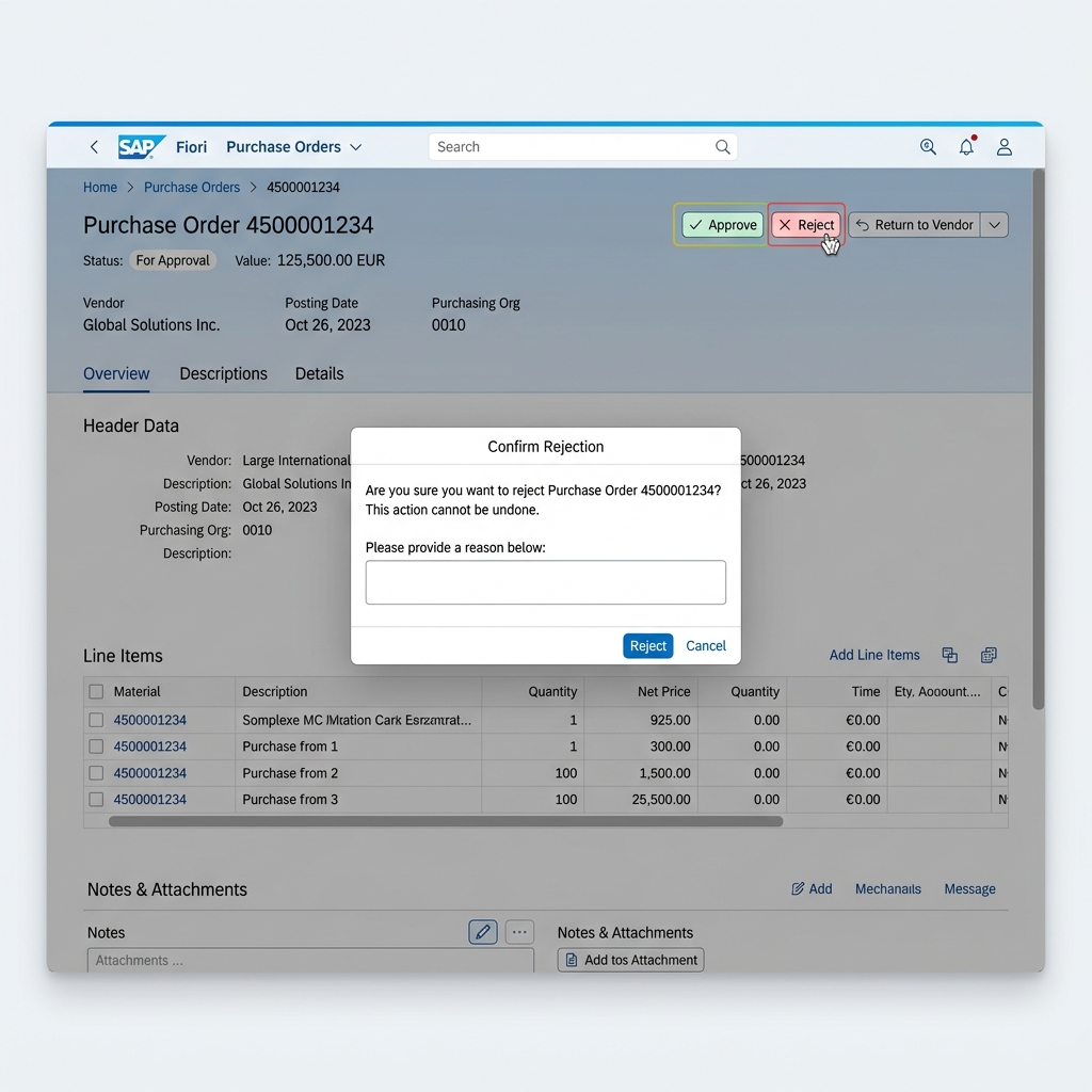 Figure 8: Surface custom action buttons in the header toolbar.
Fiori Elements supports custom actions defined in RAP Behavior Definition and surfaced through annotations:
ABAP Behavior Definition:
define behavior for ZC_SalesOrder {
    action submitForApproval
        result [1] $self;
    action cancelOrder
        parameter ZA_CancelOrderParams
        result [1] $self;
}
CDS Annotation to show action as button:
@UI.lineItem: [{
    type: #FOR_ACTION,
    dataAction: 'submitForApproval',
    label: 'Submit for Approval',
    position: 100
}]
That annotation makes “Submit for Approval” button appear in List Report toolbar — active when user selects rows. Clicking it triggers the RAP action method. No frontend controller code needed for the button or its triggering.
For actions needing parameter input — like Cancel Order requiring a cancellation reason — Fiori Elements automatically generates a popup dialog from the parameter structure definition.
Fiori Tools — Accelerating Fiori Elements Development
SAP Fiori Tools is a set of extensions for Business Application Studio and VS Code that dramatically accelerates Fiori Elements development.
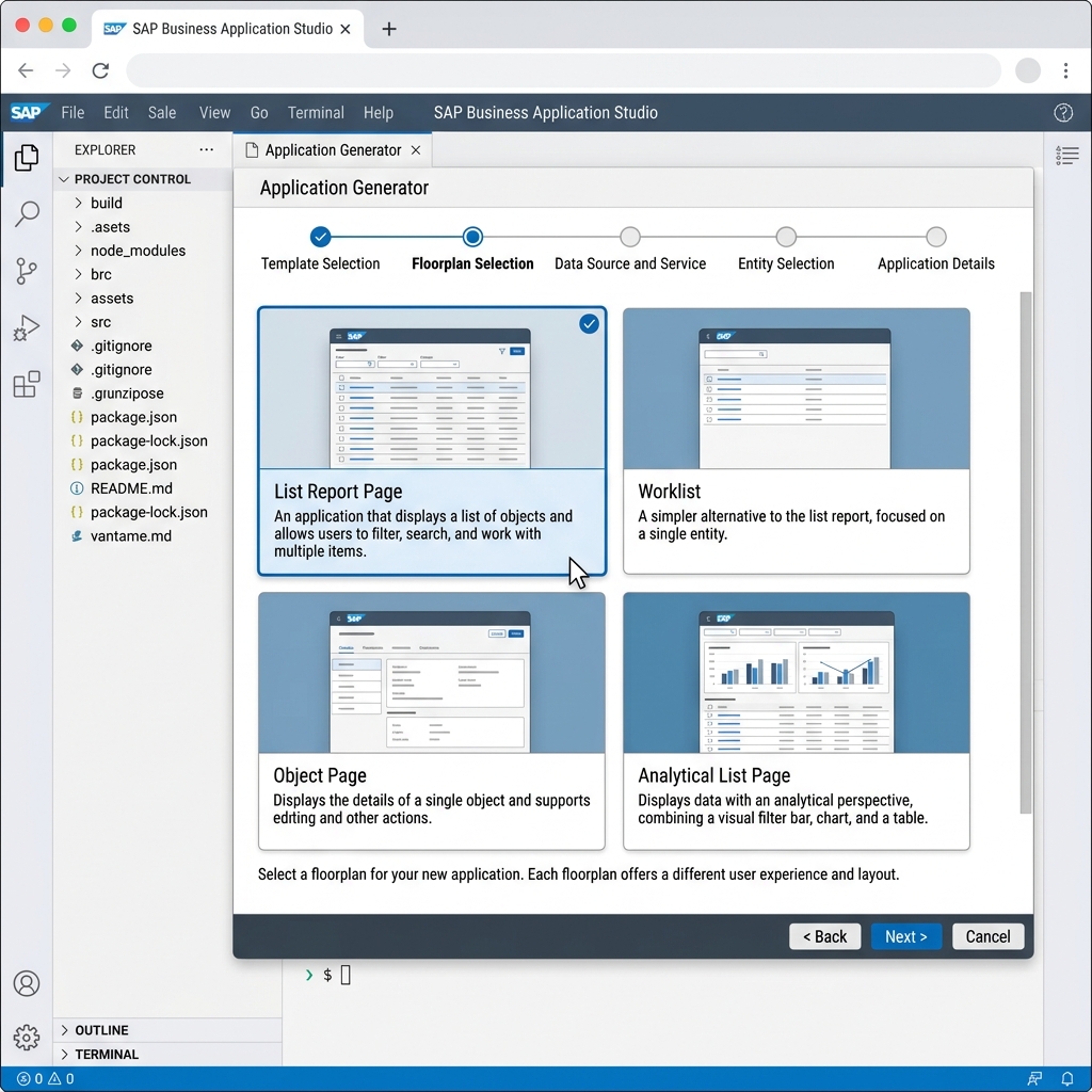 Figure 9: Page Map editor and Guided Development worksheets inside Business Application Studio.
- Application Generator — guided wizard that creates complete Fiori Elements app scaffold in minutes. Select floorplan, connect to OData service, choose entity sets — generates manifest.json, package.json, and all configuration files automatically.
- Fiori Elements Page Map — visual editor showing your app’s page structure. Add pages, configure navigation, add sections and columns — visually, without editing manifest.json manually.
- Guided Development — step-by-step wizards for adding specific features — custom columns, custom actions, filter fields, chart configurations. Generates correct annotations automatically.
- Preview with Mock Data — run Fiori Elements app locally against mock OData data — no SAP system connection needed during frontend development.
- Annotation Modeler — visual interface for managing CDS annotations without writing raw annotation syntax manually.
Using Fiori Tools properly turns a 2-week Fiori Elements project into a 3-day project. Not exaggerating — the scaffolding, annotation generation, and preview capabilities eliminate enormous amounts of manual work.
Real Project Example — Building a Complete Fiori Elements App
Let’s walk through exactly how a complete Fiori Elements app gets built on a real project. Scenario: Vendor Invoice Review app for accounts payable team.
- Define CDS View with Annotations: Create CDS Interface View
ZI_VendorInvoiceselecting from RBKP table. Create CDS Consumption ViewZC_VendorInvoicewith all UI annotations — lineItem, selectionField, facets, fieldGroups, headerInfo, chart annotations. - Create Behavior Definition: Define standard operations — read, update. Define custom actions — postInvoice, parkInvoice, returnToVendor. Define mandatory fields and field-level controls.
- Expose as OData V4 Service: Create Service Definition pointing to consumption CDS view. Create Service Binding of type OData V4 — UI. Publish and test in preview — verify all entities and operations work correctly.
- Generate Fiori Elements App using Fiori Tools: Open Business Application Studio. Run Application Generator. Select List Report + Object Page. Connect to newly published OData service. Select VendorInvoice entity set. Generate app scaffold.
- Verify and Adjust Annotations: Preview generated app. Check List Report shows correct columns from @UI.lineItem annotations. Check filter bar shows expected filters from @UI.selectionField. Check Object Page sections from @UI.facet annotations. Adjust annotation positions and labels as needed.
- Add Custom Action UI Behavior: Verify Post Invoice, Park Invoice, Return to Vendor buttons appear from @UI.lineItem action annotations. Test action triggers — confirm RAP action methods fire correctly.
- Deploy to BTP or S/4HANA: BTP deployment: build app, create MTA deployment descriptor, deploy using cf deploy command from BAS terminal. Configure destination to S/4HANA system. Add to Build Work Zone launchpad.
Total development time for this complete app — experienced developer using Fiori Tools — 3 to 5 days. Same app in custom SAPUI5 — 3 to 4 weeks. That time difference is why every project team that understands Fiori Elements uses it for standard scenarios.
Common Annotation Mistakes That Break Fiori Elements Apps
- Mistake 1: Missing @AbapCatalog.viewEnhancementCategory annotation. Modern CDS views require this annotation. Missing it causes activation errors that look completely unrelated to the actual problem.
- Mistake 2: Forgetting @Metadata.allowExtensions. Without this annotation, Fiori key user adaptation and extension annotations cannot be applied to your view. Always include it on consumption views.
- Mistake 3: Duplicate position values in @UI.lineItem. Two fields with same position number — one silently disappears. Always use unique position values with gaps (10, 20, 30).
- Mistake 4: Using @UI.hidden without understanding impact. Hidden fields still exist in OData payload but don’t render in UI. Useful for technical fields used in logic — like criticality calculation fields.
- Mistake 5: Annotation on Interface View instead of Consumption View. UI annotations belong on consumption view (ZC_). Interface view (ZI_) should stay clean for reusability.
- Mistake 6: Not testing in different screen sizes. Fiori Elements is responsive but annotation choices affect mobile layout significantly. A lineItem with 15 columns looks fine on desktop — terrible on phone. Test on mobile early.
Fiori Elements Career Value — Why This Skill Matters
Here’s the honest market reality in 2026.
Companies implementing S/4HANA need Fiori apps delivered quickly. Project timelines are tight. Budgets are fixed. A developer who can deliver Fiori Elements apps efficiently — knowing which annotations produce which UI, how to extend standard behavior cleanly, how to troubleshoot annotation-driven issues — is significantly more productive than one who builds everything from custom SAPUI5.
Hiring managers on SAP projects know this. “Fiori Elements experience” appears explicitly in job descriptions now — not just “SAPUI5 experience.” It’s a specific, valued, separately mentioned skill.
For freshers — building a complete Fiori Elements app end to end in your BTP free tier environment and being able to show and explain it is a genuinely impressive interview portfolio piece. Most fresher candidates know SAPUI5 basics. Far fewer can build a RAP-backed Fiori Elements app from scratch.
That differentiation gets noticed.
What This Means for Your Work
Fiori Elements represents SAP’s vision of how enterprise applications should be built — describe your data and intentions declaratively, let the framework handle the UI mechanics, focus developer effort on business logic and data modeling rather than UI boilerplate.
It’s not perfect. Complex requirements sometimes push past what annotations can express. Custom SAPUI5 knowledge remains valuable for those edge cases. But for the majority of Fiori development work on real projects — Fiori Elements is faster, more maintainable, more upgrade-safe, and more consistent than custom development.
The developers who understood Fiori Elements early became significantly more productive than peers who kept building everything from scratch. That productivity gap compounds over time — more apps delivered, more project experience, faster career progression.
Build one complete Fiori Elements app this week. List Report + Object Page, RAP backend, real annotations, deployed on BTP. Start to finish. That single exercise will teach you more than months of reading.
Keep building. Keep learning.
 Figure 10: Building standard Fiori Elements web interfaces to optimize business processes.
— Daksh
Self-Assessment Checkpoint
💡 **How do you map a CDS view field to a table column in a Fiori Elements List Report?**
You use the @UI.lineItem annotation directly above the field in your projection view, specifying its position (e.g., @UI.lineItem: [{ position: 10 }]) to control display order.
💡 **Where is page navigation and structure defined in a Fiori Elements app?**
It is configured in the manifest.json descriptor file under the sap.ui5/routing and sap.ui.generic.app configuration blocks, mapping target pages to floorplans.
💡 **What utility inside SAP BAS allows you to configure these annotations visually?**
The Page Map editor (part of SAP Fiori Tools) provides a visual layout editor to add fields, buttons, tables, and columns, writing annotations behind the scenes.

Written by Daksh Dedha
SAP Technical ConsultantDaksh is an SAP Technical Consultant specializing in ABAP programming, SAP S/4HANA migrations, Fiori development, and BTP cloud architecture. He authors free, hands-on tutorials to make enterprise SAP education accessible to all developers.
Test Your Knowledge
Loading question...
Quiz Completed
Related Tutorials
SAP Fiori End to End Implementation — From Backend to Launchpad in Plain Steps
Complete SAP Fiori end to end implementation guide. Covers backend activation, OData service setup, Fiori Launchpad configuration, role assignment, and testing.
SAP FioriSAP Fiori Launchpad Configuration — Complete Setup and Customization Guide
Step by step guide to SAP Fiori Launchpad configuration. Learn how to set up catalogs, groups, spaces, pages, custom tiles, and role-based access in FLP.
SAP FioriTop 30 SAP SD Interview Questions & Answers – Complete Guide
Master your next SAP Sales and Distribution (SD) functional interview. Study core concepts, the OTC cycle, Pricing Procedures, and logistics configuration.
Found this tutorial useful? Share it with your SAP development team.